Request a Call Back
Enter your contact details and one of our friendly team member will be in touch soon!.

Enter your contact details and one of our friendly team member will be in touch soon!.

It is no secret that the website is the spine of every industry. If you want your enterprise to be victorious in 2022, you’ve got to have a well-designed website.
A well-designed website can help you increase your business as a perfect design makes a grand appearance on your potential clients inducing them to take the desired action.
Common web development mistakes, however, can fast derail even your best efforts. And while you hear a lot about what to do when designing your website. But have no idea what not to do.
To give you a rim, we have summarized 5 standard website design mistakes that hurt many businesses. Dodge them while developing your website, and you should have more success in converting visitors.
1. Not Having A Straightforward CTA (Call to action)
Not having a clear CTA is a common web development mistake. Websites are like marketing and sales funnels. Your website visitors travel within that funnel to go from the prospects’ stage to the converted clients’ stage. Not providing a clear “call to action” at the right places may show not convert many hot prospects. Overdoing CTA may also lead to annoying options.
2. Poorly Designed & Irrelevant Images
We all know that photos and illustrations are a vital part of web development. When it is done well, images can clearly convey the message to the visitor. When it is not done properly, it can complicate the reader. Many organizations are still not serious about their images and use low-quality and irrelevant images. Don’t create this mistake, as low-quality images will muck up your website and hang off your visitors. Likewise, unrelated images will only confuse your visitors, inducing them not to take the desired action.
3. Not Paying Awareness To 404 Page Design Can Hurt SEO
Web design is not just restricted to developing designs and user expeditions. From the SEO point of view, numerous common website design errors can be readily avoided.
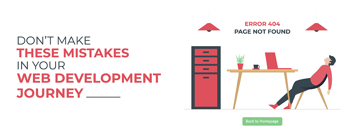
The first SEO-essential web development mistake is not having a dedicated custom 404-page template.
You can have a separate 404 page for your domain to give users something relevant, or you may use 302 or 301 redirects to link to some other page on the web. Dead links on a website harm a company’s reputation. Users feel as if the website is a fraud, and the product/service won’t be of standard. Using 302 or 301 redirects, these links could be easily handled.
Secondly, SEO-specific and common website development mistakes contain not using proper title & heading tags. Using defining page text won’t be as beneficial as explaining it in the title. Again, using bigger fonts won’t be as useful for SEO as using h1, h2 tags.
4. Not Testing To Ensure Cross Browser Compatibility
The design, like content, is a creative work that can be enhanced iteratively. Using refined analytics tools, your website analytics manager can give you data on how users navigate your website. Also, analytics and testing can help you discover broken links. B On the analytics input, you can discover the faults in the user journey. You can identify what’s working and what needs improvements, which CTAs are getting clicked, and which needs to be upgraded.
Final words
A website could be your business’s most significant investment, so you need to make it perfect to create a great first appearance. But to have a perfect SEO-friendly website you need to avoid these mistakes.
These common website design mistakes are relatively easy to avoid as well as fix. Identifying them is the hardest step. But now that you know these mistakes, so you can easily avoid or fix them.


Introduction Accessible web design is a...
Read More
It is no secret that the website is the sp...
Read More